Axes & chart options
A type alone rarely gets you a production-ready chart. These examples show the options and scales knobs that do most of the visual work — secondary Y axes, log scale, negative-value layout, rotated tick labels, and custom grid / tick colors. Each renders from a plain JSON config.
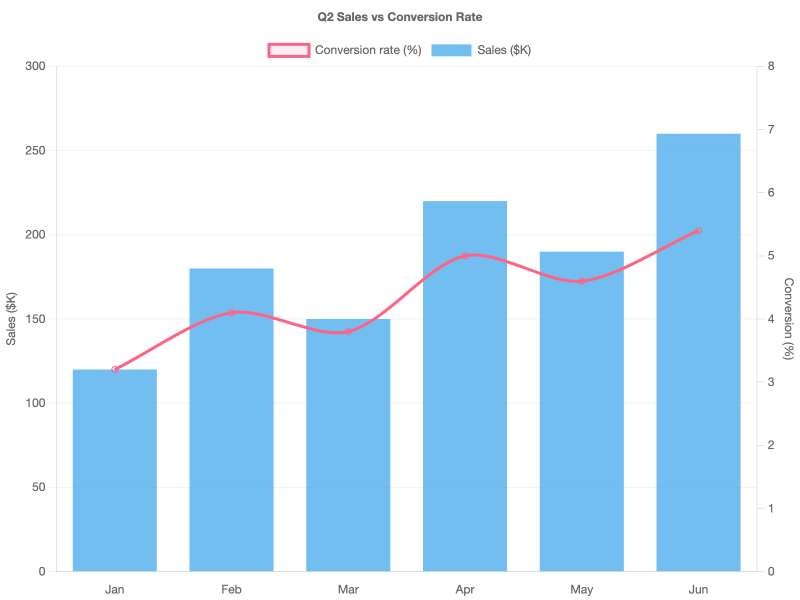
Dual axis (bar + line, two Y axes)
Mix units by giving each dataset its own yAxisID, then define two linear scales — one on the left, one on the right — in options.scales. The line is drawn on top by lowering its order.
Key pieces:
datasets[i].yAxisID— string that matches a scale ID.scales.<id>.position—"left"/"right".scales.<id>.grid.drawOnChartArea: false— stops the right axis's grid lines from doubling up with the left axis's.
Logarithmic scale
When the Y range spans several orders of magnitude, a linear axis flattens the early years into nothing. scales.y.type: "logarithmic" turns equal multipliers (×2, ×10) into equal pixel gaps.
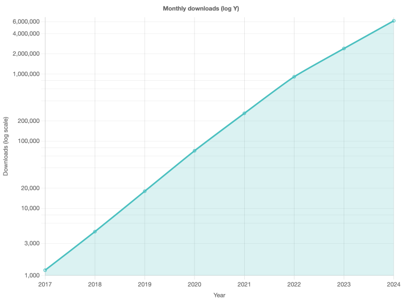
Chart.js auto-picks base-10 ticks (1, 10, 100, …). Override with scales.y.ticks.callback if you're driving from JS; for chartjs2img's JSON pipeline, leave it to the defaults.
Negative values (zero-baseline layout)
When data crosses zero, clamp the scale manually with suggestedMin / suggestedMax and use diverging per-bar colors to show direction.
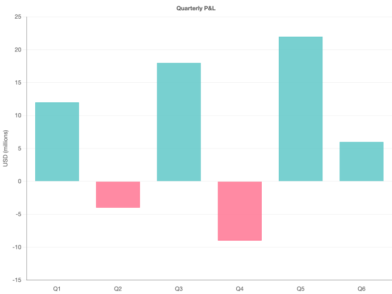
A darker border.color on the axis helps the zero line pop against the lighter grid.color inside the chart area.
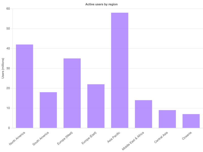
Rotated tick labels
Long category labels on the X axis overlap at narrow chart widths. Force them tilted with ticks.maxRotation / minRotation — set autoSkip: false if you don't want Chart.js to silently drop labels to make space.
Custom grid & tick styling
Everything about the axis — gridline color, dash pattern, tick color, axis border — is tunable per-scale. Good for matching a brand palette or toning down the default gray to something less assertive.
The tickBorderDash: [4, 4] pattern on the Y axis gives the dashed horizontal lines; the solid color on border.color draws the axis line itself.
Other scale options worth knowing
| Option | What it does |
|---|---|
scales.<id>.min / max | Hard-clamp the visible range (ignored data points draw outside the chart area). |
scales.<id>.suggestedMin / suggestedMax | Hint only — Chart.js still adjusts to fit the data. |
scales.<id>.beginAtZero | Force the linear axis to include 0, useful for bar charts. |
scales.<id>.reverse | Flip the axis direction (common on matrix Y axes). |
scales.<id>.stacked | Stack datasets along this axis (bar / area). |
scales.<id>.offset | Leave half a tick of padding so dots / bars don't hit the edge. |
scales.<id>.ticks.stepSize | Force a specific tick spacing. |
scales.<id>.ticks.count | Request an approximate number of ticks (Chart.js rounds to nice values). |
See chartjs2img llm for the complete list — every scale subtype (linear, logarithmic, time, category, radialLinear) exposes its own knobs on top of the shared ones.